Wordyard

Hand-forged posts since 2002

Archives

About

Greatest hits

The “millions of results are useless” myth

November 11, 2009 by Scott Rosenberg

While we’re on the subject of the value of search…

Ken Auletta is on KQED Forum right now, talking about his new Google book, and I just heard him comment on Google’s vulnerability to new competitors by hauling out the old complaint that Google’s provision of millions of results means it’s doing a poor job of serving it’s users.
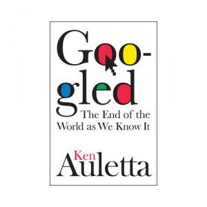
41B7NrA03OL._SS500_

“I searched for ‘the real William Shakespeare,’ ” he said (I’m paraphrasing), “and I got five million results. That’s useless.”

We hear this one all the time — and it gets Google’s value precisely wrong. When Google came along in the late ’90s we already had search engines, like AltaVista, that provided millions of results. Google is the antidote to the millions-of-results problem. All of Google’s value — and the reason that Google originally rose to prominence — was that it solved this problem, and got columnists like me to rave about its value while it was still a tiny startup company.

Let’s do that “real William Shakespeare” search. Right now I actually get 15 million results. Who cares? Nobody ever looks past the first, or at most the second or third, page of results. And Google’s first page of results on this query is not bad at all. Many of the top links are amateur-created content, but most of them provide useful secondary links. As a starting point for Web research it’s a pretty good tool. If you fine-tune your query to “Shakespeare authorship debate” you do even better.

Yes, it’s true that the Google search box is less useful with generalized product and commercial searches (like “London hotels”), where the results are laden with ads and fought over by companies armed with SEO tactics. Google has all sorts of flaws. But it’s time to bury the old “millions” complaints. They’re meaningless. And Auletta’s willingness to trot them out doesn’t give me much hope for the value of his new book.

Filed Under: Media, Technology

How Twitter makes blogs smarter

July 20, 2009 by Scott Rosenberg

Probably the single question I’m most often asked as I talk to people about Say Everything is: How has Twitter changed blogging? Twitter’s rapid growth — along with the preference of some users for sharing on Facebook and the rise of all sorts of other “microblogging” tools, from Tumblr and Posterous to Friendfeed and identi.ca — is altering the landscape. But I think the result is auspicious in the long run, both for Twitter-style communication and for good old traditional blogging. Here’s why.

If you look back to the roots of blogging you find that there has always been a divide between two styles: One is what I’ll call “substantial blogging” — posting longer thoughts, ideas, stories, in texts of at least a few paragraphs; the other is “Twitter-style” — briefer, blurtier posts, typically providing either what we now call “status updates” or recommended links. Some bloggers have always stuck to one form or another: Glenn Reynolds is the classic one-line blogger; Glenn Greenwald and Jay Rosen are both essay-writers par excellence. Other bloggers have struggled to balance their dedication to both styles: Just look at how Jason Kottke has, over the years, fiddled with how to present his longer posts and his linkblog: Together in parallel, interspersed in one stream, or on separate pages?

A historical footnote: Twitter’s CEO is Evan Williams, who was previously best known as the father of Blogger. You find a style of blogging that’s remarkably Twitter-like on the blogs that became the prototype for Blogger — a private weblog called “stuff” that was shared by Williams and Meg Hourihan at their company, Pyra, and a public blog of Pyra news called Pyralerts (here’s a random page from July 1999). The same style later showed up in many early Blogger blogs: brief posts, no headlines, lots of links — it’s all very familiar. In some ways, with Twitter, Williams has just reinvented the kind of blogging he was doing a decade ago.

Today, the single-line post and the linkblog aren’t dead, but certainly, much of the energy of the people who like to post that way is now going into Twitter. It’s convenient, it’s fun, it has the energy of a shiny novelty, and it has the allure of a social platform.

But there’s a nearly infinite universe of things you might wish to express that simply can’t fit into 140 characters. It’s not that the Twitter form forces triviality upon us; it’s possible to be creative and expressive within Twitter’s narrow constraints. But the form is by definition limited. Haiku is a wonderful poetic form, but most of us wouldn’t choose to adopt it for all of our verse.

From their earliest days, blogs were dismissed as a mundane form in which people told us, pointlessly, what they had for lunch. In fact, of course, as I reported in Say Everything‘s first chapter, the impulse to tell the world what you had for lunch appears to predate blogging, stretching back into the primordial ooze of early Web publishing.

Today, at any rate, those who wish to share quotidian updates have a more efficient channel with which to share them. This clarifies the place of blogs as repositories for our bigger thoughts and ideas and for more lasting records of our own experiences and observations.

There are a couple of serious limitations to Twitter as a blog substitute, beyond the character limit. But this post has gotten long — even for a post-Twitter blog! — so I’m going to address them in my next post, tomorrow.

Filed Under: Blogging, Business, Say Everything, Technology

“Images are not a representation of reality”

July 8, 2009 by Scott Rosenberg

Last Sunday the NY Times mag ran a photo feature on abandoned, half-built real estate projects — casualties of the big bust. The pictures were stunningly otherwordly — eerily lit, human-free canvases of financial devastation. Dayna, my wife, handed me the magazine and asked, “Are these computer generated?” They had, she added, an uncanny-valleyish feel.

The feature noted that photographer Edgar Martins “creates his images with long exposures but without digital manipulation.” Now it turns out the Times has removed the photos from its website and posted an embarrassing editor’s note admitting that the photos had been “digitally manipulated: “Most of the images,” the editors wanly declare, “did not wholly reflect the reality they purported to show.” It seems that, in some sort of misguided effort to create more pleasing images, Martins duplicated and then flipped portions of some photos to create a barely perceptible mirror image: a sort of fearful — but now, we know, bogus — symmetry.

As I read up on the controversy (here’s the original conversation on Metafilter that exposed the matter, here’s Simon Owens’ account of how that happened, and here’s some photographic detail) I had two thoughts: One, sounds like this photographer didn’t come clean to his editors, and that’s unprofessional and probably unforgivable. But, two: the images did not wholly reflect the reality they purported to show? Huh? Does any image? Can any image? Or article, or representation of any sort?

Before I get any more Borgesian on you, let me point you back to the interviews I did with the photographer and multimedia artist Pedro Meyer back in the early 90s — one from the San Francisco Examiner, and one from Wired. (Please note that the Wired piece got mangled somewhere between the magazine and the Web; the intro paragraph appears at the end.)

This, from the Examiner piece:

Pedro Meyer points to one of his photographs and says, “Tell me what’s been altered in this picture.”

The photo shows a huge wooden chair on a pedestal – a Brobdingnagian seat that looms over the buildings in the background with the displaced mystery of an Easter Island sculpture.

It’s difficult to say what’s going on here: A trompe l’oeil perspective trick? Or the product of digital special effects?

Meyer is a serious artist and philosopher of technology, but today he’s playing a little game of “what’s wrong with this picture?”… The truth about the chair photo is that it’s a “straight” image: It’s just a really big chair.

Meyer says he took the shot outside an old furniture factory in Washington, D.C. But the self-evidently transformed pictures that surround it in his exhibit – like that of a pint-sized old woman on a checkerboard table carrying a torch toward an angelic girl many times her size – call its accuracy into question. We stare and distrust our eyes.

So is Pedro Meyer, who started out as a traditional documentary photographer, out to subvert our faith in the photographic image, our notion that “pictures never lie”? You better believe it.

“I think it’s very important for people to realize that images are not a representation of reality,” Meyer says. “The sooner that myth is destroyed and buried, the better for society all around.”

[You can see that chair photo in the “Truths and Fictions” gallery available off this page — click through to screen 26.]

And this, from the Wired interview:

I’m not suggesting that a photograph cannot be trustworthy. But it isn’t trustworthy simply because it’s a picture. It is trustworthy if someone we trust made it.

You’re interviewing me right now, you’re taking notes and taping the conversation, and at the end you will sit down and edit. You won’t be able to put in everything we talked about: you’ll highlight some things over others. Somebody reading your piece in a critical sense will understand that your value judgments shape it. That’s perfectly legitimate. Turn it around: let me take a portrait of you, and suddenly people say, That’s the way he was.

We don’t trust words because they’re words, but we trust pictures because they’re pictures. That’s crazy. It’s our responsibility to investigate the truth, to approach images with care and caution.

After learning what Meyer was trying to teach me, I can’t get too huffy about Martins’ work. There is no sharp easy line between photos that are “manipulated” and those that aren’t; there is a spectrum of practice, and when a photo is cropped or artificially lit or color-adjusted or sharpened or filtered in any way it is already being manipulated, even if Photoshop is never employed. Martins’ pictures are beautiful and arresting, and if he’d simply told the world what he was up to, I don’t think anyone would be too upset.

Of course, if Martins had been forthright the Times would probably not have printed his work, because it has an institutional commitment to, I guess, attempt to “wholly reflect” reality. Somehow.

I don’t demand that of photographers or journalists or newspapers. I just ask them to tell me what they’re up to. As David Weinberger put it at the Personal Democracy Forum: “Transparency is the new objectivity.”

Filed Under: Culture, Media, Technology

iBank failure: reporting problems

June 1, 2009 by Scott Rosenberg

Besides Ecco, Quicken is really the last app that I still need Windows for. (Quicken for the Mac is way inferior.) So I thought I’d finally figure out which of the Mac personal-finance contenders would best suit my needs: simple budget and expense tracking on several checking accounts and a credit card or two. All evidence pointed to iBank. I downloaded the program on free trial and checked it out. The register worked nicely, the interface was smooth, and it seemed like importing my 12 years’ worth of Quicken data could be accomplished. So I plunked down the not inconsiderable charge for the program, spent an hour or two figuring out how to avoid having transfers appear twice after the import, and thought I’d solved my problem.

Then I tried to create a report. And the program that had until that moment seemed well-built and -designed turned to sand between my fingers. Report? iBank basically says. What’s that? Oh, you have to create a chart and then you can generate a report? That seems silly — I don’t need a pie chart, it doesn’t tell me what I need to know, but if I have to pay the pie chart tax before I can get to my report, OK! I’ll make some pies! So finally I click the button to make a report and wait for the program to ask me some questions about, you know, which categories and dates and accounts I want to include in the report. But there is no dialogue box. The program grinds through its data and a minute later it spits out a clumsily formatted PDF. Wait a minute; I can customize the chart, and that should then change the report, right? But no, that would be too logical. Whatever I do to the chart, the report is still the same useless, largely unreadable junk.

This is a problem, because, really, the only point to the tedium of entering all these transactions is that at the end of the labor you can click a few buttons and actually gain some insight into where and how you are spending your money. iBank is like a financial-software roach motel: you can get your data in easily enough, but just try getting useful information out the other side!

My guess is that coding up a useful report generator must’ve fallen off the developers’ feature list somewhere along the way and keeps dropping off the upgrades list. Obviously I’m hugely disappointed, particularly since the trial version of iBank doesn’t let you enter more than a handful of transactions, so you never really have the chance to test out the report quality.

I think the next step is to give up on this category altogether and experiment with the online/cloud-based alternatives. Of the available choices, Wesabe, which I’ve begun playing with, and Mint appear to be the likeliest contenders. I’ll let you know how it goes, and welcome any tips and experiences you may have.

Filed Under: Business, Personal, Software, Technology

Do you prefer Google Wave’s swirl or a clean river?

May 29, 2009 by Scott Rosenberg

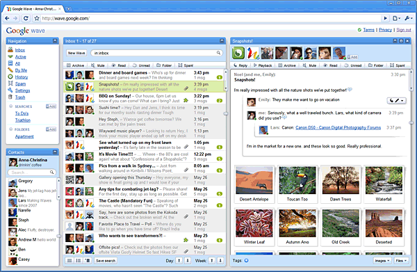
Google Wave interface

Google’s Wave announcement yesterday kicked off an orgy of geek ecstasy yesterday. Why not? A novel new interface combining email, instant-messaging, social networking and sharing/collaboration, all backed by Google’s rock-solid platform, and open-sourced to boot. Who couldn’t get excited?

When I first looked at the screenshots and demo of Wave, I got excited too: It’s a software project with big ambitions in several directions at once, and I have a soft spot in my heart for that. But the longer I looked, the more I began thinking, whoa — that is one complex and potentially confusing interface. Geeks will love it, but is this really the right direction for channeling our interactions into software?

One of the most interesting pieces I read this week was this report on a scholarly study of information design comparing the effectiveness of one-column vs. three-column layouts. The focus was more on social-networking sites (Facebook vs. LinkedIn) than on news and reading, but I think the conclusions still hold: People like single-column lists — the interface that Dave Winer calls “the River of News” and that most of us have become familiar with via the rise of the blog.

In Say Everything I trace the rise of this format in the early years of the Web, when designers still thought people wouldn’t know how to, or wouldn’t want to, scroll down a page longer than their screen. It turns out to be a natural and logical way to organize information in a browser. It is not readily embraced by designers who must balance the needs and demands of different groups in an organization fighting for home-page space; and it is the bane of businesspeople who need to sell ads that, by their nature, aim to seduce readers’ attention down paths they didn’t choose. Nonetheless, this study validates what we know from years of experience: it’s far easier to consume a stream of information and make choices about what to read when there’s a single stream than when you’re having to navigate multiple streams.

Wondering why Twitter moved so quickly from the geek precincts into the mainstream? For most users, tweets flow out in a single stream.

I think about all this when I look at the lively but fundamentally inefficient interfaces some news sites are playing with. Look at the Daily Beast’s unbearably cacophonous home page, with a slideshow centerpiece sitting atop five different columns of headlines. There is no way to even begin to make choices in any systematic way or to scan the entirety of the site’s offering. When everything is distracting, nothing is arresting. You must either attend to the first tabloid-red editorial shout that catches your eye — or, as I do, run away.

I feel almost as put off by the convention — popularized by Huffington Post and now increasingly common — of featuring one huge hed and photo and then a jumble of run-on linked headlines underneath. These headlines always seem like orphan captions to me. The assumption behind this design is that you must use the first screen of content to capture the reader’s attention. That’s only the case if you are waving so many things in front of the readers’ eyes in that one screen that you exhaust them.

Google Wave has an open API that will presumably allow developers to remix it for different kinds of users. So just as Twitter’s open API has allowed independent application providers to reconfigure the simple Twitter interface into something far more complex and geeky for those who like that, perhaps Wave will end up allowing users who like “rivers” to take its information in that fashion. But the default Wave looks like a pretty forbidding thicket to navigate.

ELSEWHERE: Harry McCracken wonders whether Wave is “bloatware.”

Filed Under: Blogging, Media, Say Everything, Technology

When MP3 was young

April 2, 2009 by Scott Rosenberg

In early 2000 I got a call from a producer at Fresh Air, asking if I’d like to contribute some technology commentary. Fresh Air is, to my mind, one of the very best shows on radio, so yes, I was excited. For my tryout, I wrote a brief piece about this newfangled thing called MP3 that was just beginning to gain popularity. We’d been covering the MP3 scene at Salon since 1998, but it was still a novelty to much of the American public. I went down to KQED and recorded it. As far as I knew everyone liked it. But it never aired. I had four-month-old twins at home and a newsroom to manage at work. I forgot all about it.

In a recent file-system cleanup I came across the text of the piece and reread it, and thought it stood up pretty well. The picture it presents — of a future for music in which its enjoyment is divorced from the physical delivery system — has now largely come to pass. But at the time I was writing, the iPod was 18 months or so in the future; the iTunes store even farther out; the “summer of Napster” still lay ahead; and the record labels’ war on their own customers was still in the reconaissance phase.

Here it is — a little time capsule from a bygone era, looking forward at the world we live in today:

The phonograph I had as a kid played records at four different speeds. 33 was for LPs, 45 was for singles. There were two other speeds, 16 and 78, but I had no idea what they were for — they made singers on regular LPs sound like they’d sunk to the ocean floor or swallowed helium. Later I learned that the 78 speed was for heavy old disks, mostly from the ’20s, ’30s and ’40s; I’m still not clear what 16 was all about.

These old-fashioned playing speeds represented what, in today’s era of rapid obsolescence, we’d call “legacy platforms” — outmoded technologies that are no longer in wide use. The phonograph itself became a “legacy platform” in the 1980s with the advent of the compact disk. Now it’s the CD’s turn, as the distribution of music begins to move onto the Internet.
[Read more…]

Filed Under: Media, Music, Personal, Technology

Ecco in the cloud with Amazon

March 24, 2009 by Scott Rosenberg

Late last night — because late night is the time to tinker with software! — I decided to test drive Dave Winer’s recent crib sheet on setting up an Amazon Web Services cloud-based server. Dave called it “EC2 for Poets” (EC2 is the name of Amazon’s service), and I’ve always been a fan of “Physics for Poets”-style course offerings, so — though I do not write poetry — he lured me in.

For the uninitiated, Amazon has set up a relatively simple way for anyone to purchase and operate a “virtual server” — a software-based computer system running in their datacenter that you access across the Net. It’s like your own Windows or Linux box except there’s no box, just code running at Amazon. If you’ve ever run one of those arcade video-game emulators on your home computer, you get the idea: it’s a machine-within-a-machine, like that, only it’s running somewhere else across the ether.

Dave provided crystal clear step-by-step instructions for setting up and running one of these virtual servers. (Writing instructions for nonprogrammers is, as they say in software-land, non-trivial. So a little applause here.) The how-to worked hitch-free; the whole thing took about a half-hour, and by far the longest part was waiting for Amazon to launch the server, which took a few minutes.

But what should one do with such a thing? Dave’s sample installation runs a version of his OPML editor, an outlining tool. That gave me an idea.

Regular readers here know of my dependence on and infatuation with an ancient application called Ecco Pro. It’s the outliner I have used to run my life and write my books for years now. It has been an orphaned program since 1997 but it still runs beautifully on any Win-32 platform; it’s bulletproof and it’s fast. My one problem is that it doesn’t share or synchronize well across the Net (you need to do Windows networking to share it between machines, and I just don’t do that, it’s never made sense to me, as a one-man shop with no IT crew).

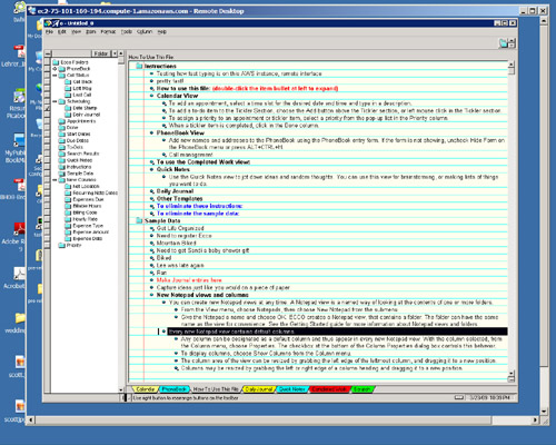
But what if I were running Ecco on an Amazon-based server? Then I could access the same Ecco document from any desktop anywhere — Macs too. So I downloaded the Ecco installer (using a browser running on the Amazon-server desktop, which you access via the standard Windows Remote Desktop Connection tool), ran it, and — poof! — there it was, a 12-year-old software dinosaur rearing its ancient head into the new Web clouds:

eccoincloud

What you see here in the innermost window is Ecco itself (displaying some of the sample data it installs with). Around that is the window framing the remote desktop — everything in there represents Windows running in the cloud. The outermost frame is just my own Windows desktop.

This remains very much in Rube-Goldberg-land at this point. Accessing this remote server still requires a few more steps than you’d want to go through for frequent everyday use. (To me it felt like it was about at the level that setting up your own website was in 1994 when I followed similar cribsheets to accomplish that task.) And the current cost of running the Amazon server — which seems to be about 12.5 cents per hour, or $3 a day, or over $1000 a year — makes it prohibitive to actually keep this thing running all the time for everyday needs.

On the other hand, you have to figure that the cost will keep dropping, and the complexity will get ironed out. And then we can see one of many possible future uses for this sort of technology: this is where we’ll be able to run all sorts of outdated and legacy programs when we need to access data in different old formats. Yesterday’s machines will virtualize themselves into cloud-borne phantoms, helping us keep our digital memories intact.

Filed Under: Net Culture, Software, Technology

“Stealing MySpace” review in Washington Post

March 16, 2009 by Scott Rosenberg

It’s been about a decade since I did my last book review for the Washington Post, of a Marshall McLuhan biography, so it was time for a return engagement, I guess! Yesterday’s Post featured my review of Wall Street Journal reporter Julia Angwin’s new book on the story of MySpace. (Here’s the book’s site.)

The book is very thorough, dogged business reporting, worth reading if you want to know about MySpace’s origins in the murk of the Web’s direct-marketing demimonde or if you’re interested in the corporate maneuvering around Rupert Murdoch’s 2005 acquisition of the company. It offers only some brief glimpses of the culture of MySpace, though, and I think MySpace is more interesting for the vast panorama of human behavior it provides than for its limited innovations as a Web company or for the ups and downs of its market value. Here’s the review’s conclusion:

Angwin tries to cast MySpace as “The first Hollywood Internet company” — freewheeling, glitzy, “where crazy creative people run the show” — in contrast to what I guess we’d have to call the Internet Internet companies, like Silicon Valley-based Facebook, where programmers rule the roost. But that’s a bit of a false distinction: Programmers can be crazily creative people, too, and plenty of creative types have learned to master technology. (See, for example, Pixar.)

You can’t help getting the impression from “Stealing MySpace” that MySpace’s founders, however smart and dogged they may have been, were also opportunists who simply got lucky. That leaves us wondering about the wisdom of Murdoch’s acquisition. Facebook surpassed MySpace long ago in innovation, buzz and, more recently, actual traffic, according to some tallies. It has thereby stolen MySpace’s claim to being “most popular” and rendered Angwin’s subtitle obsolete.

Sic transit gloria Webby. Was Murdoch’s purchase of MySpace a savvy coup or just a panicked act of desperation, like Time Warner’s far more costly AOL mistake? It will take at least a few more years before we know for sure. By then, no doubt, both MySpace and Facebook will have been elbowed aside by some newcomer nobody has heard of today.

Filed Under: Books, Business, Media, Technology

Journal steps in Net neutrality hornet’s nest

December 15, 2008 by Scott Rosenberg

One of the reasons I’ve proposed MediaBugs as my project in the Knight News Challenge is that professional news organizations don’t have a very good record of transparency and responsiveness when it comes to fixing errors. Today’s tempest over the Wall Street Journal’s front page story on Net neutrality offers a nice illustration of what I mean.

The hook of the Journal piece was a report of documents that showed Google, long considered a staunch supporter of Net neutrality, was “quietly” changing its tune by “approaching major cable and phone companies that carry Internet traffic with a proposal to create a fast lane for its own content.” In addition, the article said, “prominent Internet scholars, some of whom have advised President-elect Barack Obama on technology issues, have softened their views on the subject.” The only scholar discussed in any detail was Lawrence Lessig.

Admittedly, the Net neutrality issue is complex, both technically and as a legal/policy matter. But it’s precisely the sort of topic that the Wall Street Journal is supposed to get right. And both key subjects of the story, Google and Lessig, have now stepped forward to say that the story is simply wrong.

Google posted a response saying that what it’s proposing is a species of caching of Web content to speed its delivery; the service provider wouldn’t be deciding which content gets treated better. (David Weinberger explains this in more and better detail.) The Journal story did not provide readers with any hint of an understanding of that aspect of the issue.

The Journal Web site offered a roundup of critical response to the story this morning. But it’s interesting to note the tone and substance of this roundup: Its lead says that the article “certainly got a rise out of the blogosphere.” It goes on to list a variety of responses to the piece, without ever dealing with the heart of the issue, which is that the key players in the story say that the story is wrong.

The Journal roundup describes Lessig as “critical of the story” but fails to say why. What Lessig says is that the original WSJ piece claimed that he had shifted his position on the issue, and he has not done so: unlike some others in the Net neutrality camp, he has consistently supported the idea of “fast lanes” on the Web as long as everyone has equal access to them.

Net neutrality isn’t easy to explain. But the Journal story had more room than most to try to do so. Even if the writers believe that Google’s explanation of its position is somehow deceptive or insincere, they owe it to their readers to include that argument. The initial story’s failures are only compounded by the follow-up roundup, which purports to cover the bases of Web reactions but leaves out the most importance responses.

This happens all the time: A newspaper does a shoddy job of covering a complex issue; then, when people raise questions about the story’s accuracy, the paper views their criticism as sour grapes, and never bothers to deal with the substance of the complaints.

Here, Google and Lessig aren’t saying merely, “this was a bad story.” They’re both saying, “We are principals to this story, and the story got our position wrong, and then used that error as a news peg.” I’ll be curious to see whether the Journal follows up further with these complaints. Its readers deserve better.

Filed Under: Media, Technology

Link backlog catchup: Denton doom, Facebook futures, Time’s cyberporn past

December 12, 2008 by Scott Rosenberg

  • Doom-mongering: A 2009 Internet Media Plan: Last month Nick Denton predicted a 40 percent decline in the online ad market. Nick is gloomy even in the best of times, so I’m hardly surprised, but this time around? The pessimists keep winning their bets. 40 percent drop in ad revenue for ad-supported businesses is not a decline, it’s a cataclysm. If it’s right, we’re just at the start of a cycle that will be even worse for this industry than the 2000-2001 downturn.
  • Peter Schwartz: Facebook's Face Plant: The Poverty of Social Networks and the Death of Web 2.0: Web 2.0 will die. Facebook is all trivia, and it will go the way of AOL. I agree with about 1/2 of this. Let’s forget about whatever “Web 2.0” is and talk about Facebook. FB’s effort to cut the difference between walled garden and open platform will work in the short run, probably help it keep growing and even figure out how to make some money through the downturn; but long term I don’t see how it keeps the most engaged users from jumping ship to truly open versions of its services, which will take maybe 5-10 years to go truly mainstream, but Will Happen, most definitely. See previous examination of these issues in previous examination of these issues in Technology Review from last summer.
  • The 463: Inside Tech Policy: Learnings from THE Cyberporn Story: Interesting exhumation/recap of the big 1995 Time Cyberporn story fracas, which I followed on the Well and covered in the SF Examiner as an example of “collective online media criticism.”

Filed Under: Links, Media, Technology

« Previous Page
Next Page »