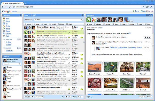
Google’s Wave announcement yesterday kicked off an orgy of geek ecstasy yesterday. Why not? A novel new interface combining email, instant-messaging, social networking and sharing/collaboration, all backed by Google’s rock-solid platform, and open-sourced to boot. Who couldn’t get excited?
When I first looked at the screenshots and demo of Wave, I got excited too: It’s a software project with big ambitions in several directions at once, and I have a soft spot in my heart for that. But the longer I looked, the more I began thinking, whoa — that is one complex and potentially confusing interface. Geeks will love it, but is this really the right direction for channeling our interactions into software?
One of the most interesting pieces I read this week was this report on a scholarly study of information design comparing the effectiveness of one-column vs. three-column layouts. The focus was more on social-networking sites (Facebook vs. LinkedIn) than on news and reading, but I think the conclusions still hold: People like single-column lists — the interface that Dave Winer calls “the River of News” and that most of us have become familiar with via the rise of the blog.
In Say Everything I trace the rise of this format in the early years of the Web, when designers still thought people wouldn’t know how to, or wouldn’t want to, scroll down a page longer than their screen. It turns out to be a natural and logical way to organize information in a browser. It is not readily embraced by designers who must balance the needs and demands of different groups in an organization fighting for home-page space; and it is the bane of businesspeople who need to sell ads that, by their nature, aim to seduce readers’ attention down paths they didn’t choose. Nonetheless, this study validates what we know from years of experience: it’s far easier to consume a stream of information and make choices about what to read when there’s a single stream than when you’re having to navigate multiple streams.
Wondering why Twitter moved so quickly from the geek precincts into the mainstream? For most users, tweets flow out in a single stream.
I think about all this when I look at the lively but fundamentally inefficient interfaces some news sites are playing with. Look at the Daily Beast’s unbearably cacophonous home page, with a slideshow centerpiece sitting atop five different columns of headlines. There is no way to even begin to make choices in any systematic way or to scan the entirety of the site’s offering. When everything is distracting, nothing is arresting. You must either attend to the first tabloid-red editorial shout that catches your eye — or, as I do, run away.
I feel almost as put off by the convention — popularized by Huffington Post and now increasingly common — of featuring one huge hed and photo and then a jumble of run-on linked headlines underneath. These headlines always seem like orphan captions to me. The assumption behind this design is that you must use the first screen of content to capture the reader’s attention. That’s only the case if you are waving so many things in front of the readers’ eyes in that one screen that you exhaust them.
Google Wave has an open API that will presumably allow developers to remix it for different kinds of users. So just as Twitter’s open API has allowed independent application providers to reconfigure the simple Twitter interface into something far more complex and geeky for those who like that, perhaps Wave will end up allowing users who like “rivers” to take its information in that fashion. But the default Wave looks like a pretty forbidding thicket to navigate.
ELSEWHERE: Harry McCracken wonders whether Wave is “bloatware.”
Post Revisions:
- November 13, 2015 @ 06:26:57 [Current Revision] by Scott Rosenberg
- May 29, 2009 @ 09:10:00 by Scott Rosenberg
