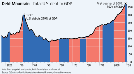
The Journal published one of those jaw-dropping charts about the U.S. national debt last Thursday, and it looked pretty bad:
There are two things to argue about here: One is the economic debate about how dangerous this “debt mountain” really is, and whether deficit-cutting today amid high unemployment would just stall the economic recovery (the famous “mistake of 1936”).
The other is the political debate. We’re in the middle of an election cycle, so charts like this fuel voter anger and “throw the bums out” sentiment.
I’m a timeline-oriented sort of person, and so the first thing I did when I looked at this chart was ask, “OK, let’s plot the presidential administrations by party along the horizontal axis and see what we find.” Since what I found was pretty remarkable, I marked up the chart below. Blue bars are Democratic administrations.
Pretty much speaks for itself, no? The main observation is that the huge runups in the debt that we’ve experienced since 1980 are almost entirely the results of the policies of two Republican presidents, Reagan and Bush Jr. (The elder Bush deserves some credit for a willingness to tackle the debt through a modest tax increase.) Yes, these presidents sometimes had the cooperation of some Democrats in Congress. But the disastrous supply-side-style tax cut policies were authored by these presidents’ administrations, and they are responsible for them.
The truth of the last three decades of American economic history is simple: The GOP has repeatedly pursued a policy of “cut taxes and let our kids pay for it.” Some supported it out of a mistaken belief that tax cuts would always pay for themselves in economic growth. Others supported it out of a Machiavellian belief (“drag it into the bathroom and drown it in the bathtub”) that if you cut taxes enough, you could force the government to scuttle popular government programs that Republicans detest like Medicare and Social Security. Others supported it out of plain old self-interest (tax cuts are always popular).
Whatever their motivations, every Republican politician who rails against the evils of the debt should be shown this chart and asked to explain it.
CORRECTION/UPDATE: As William Sullivan points out in comments, this chart, which I mistook for a graph of public debt only, actually aggregates public and private debt. I’ll poke around for a public-debt-only graph. In the meantime, it’s interesting to think, gee, what does it mean that both public and private debt together surge under our most recent Republican administrations? The positive spin, I suppose, would be: Business is humming and consumers are confident during these expansive GOP eras so people take on more debt.
Given what we experienced in 2008, however, I think a more accurate read would be: Our supposedly conservative Republican presidents actually presided over massively risky leveraging of our economy without thinking about how either the government or private citizens would actually pay it all off. Which, to me — speaking as a liberal who has paid off his credit card bill every month of my adult life — sounds like the opposite of “conservative.”
Post Revisions:
- July 19, 2010 @ 19:17:56 [Current Revision] by Scott Rosenberg
- July 19, 2010 @ 12:37:40 by Scott Rosenberg
- July 19, 2010 @ 12:34:37 by Scott Rosenberg
- July 19, 2010 @ 12:34:22 by Scott Rosenberg


