
My book Dreaming in Code — which I first conceived in 2002, started researching and proposal-writing in 2003, got a contract for in 2004, wrote mostly in 2005, and saw through the editing and production process in 2006 — will arrive in bookstores in about two weeks. I am torn between elation and exhaustion. Mostly, I’m deeply happy that — in a world where writers’ work is too often run through a gantlet of crass attitudes, careless handling and fickle judgments — I got the opportunity to write exactly the book I wanted to.
For the next several weeks, this blog will become heavily focused on Dreaming in Code, its reception and surrounding events. Ideally, that will interest you; if not, apologies, but you’ve been warned.
Let’s start with the saga of the book’s jacket. When my editor at Crown, Rachel Klayman, and I first discussed the cover, we agreed that it might be fun to aim for a classical design, one that ran counter to some cliches of the tech-books field (no mouse on the cover, please!) and that signaled, in a light-hearted way, one theme of the book — the aspiration toward elegance shared by the software developers at the story’s center.
 So the wizard designer at Crown came up with this, and we were pretty happy with it. This cover actually went out to the first readers of the book, appeared in early catalog pages, and was transmitted seemingly instantaneously onto Amazon’s page for the book, which first appeared online scarily soon after I’d completed the manuscript.
My agent, however, got concerned, raised some questions, and got the rest of the book’s team equally concerned. For one thing, given that the book tells a story about computer programming, mightn’t it be a good idea for that to be, er, a little more evident from the cover? And then there was the slight problem that some other book that had sold a few copies and also, coincidentally, features the word “Code” prominently in its title uses a similar crimson-and-gold color scheme.
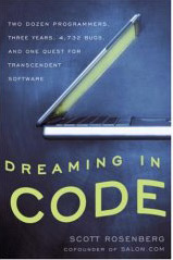 So it was back to the drawing board for our designer, and we wound up with the splendid cover you see here — its embossed electric-green title mysteriously undulating in a blue-black void.
What I learned from this process is that my own default preference for being subtle and ironic is probably not the best guide for selecting a jacket design. After all, people really do judge a book by its cover. There may only be a nanosecond’s chance to catch someone’s eye. In that instant, you might as well take the direct approach.
[tags]dreaming in code, publishing[/tags]
Post Revisions:
There are no revisions for this post.